
Scatter plot of temperature and ice cream sales
An example figure from the Scatter Plot Generator.
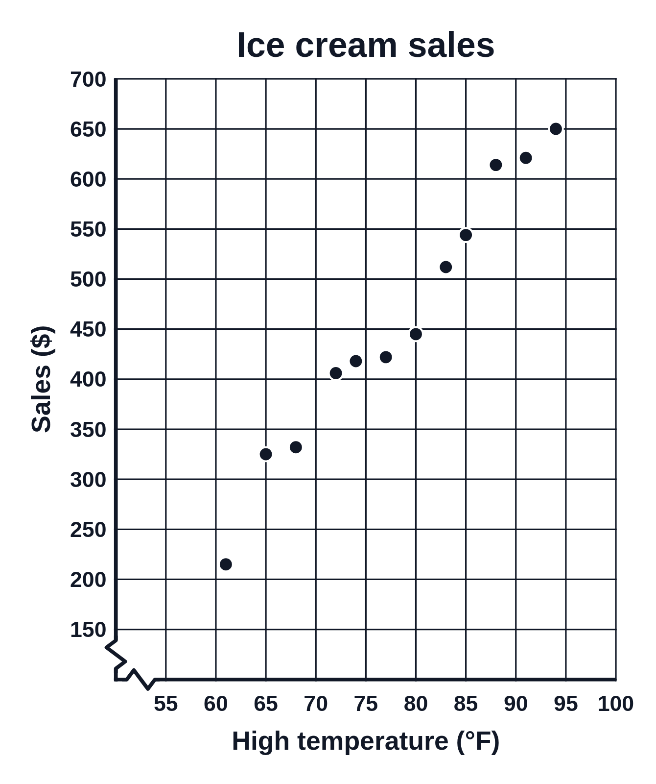
Editing opens it in the Scatter Plot Generator with these settings, to change anything and copy or download your own.
Answer key
- Number of points: 12
- Line of best fit (least squares): y = 12.54x − 521.82
- r = 0.99 (strong positive correlation), r² = 0.97
Free to use in your tests, worksheets, slides or anything else, no credit needed. Public domain under CC0 1.0. How to reuse our figures
More Scatter Plot examples
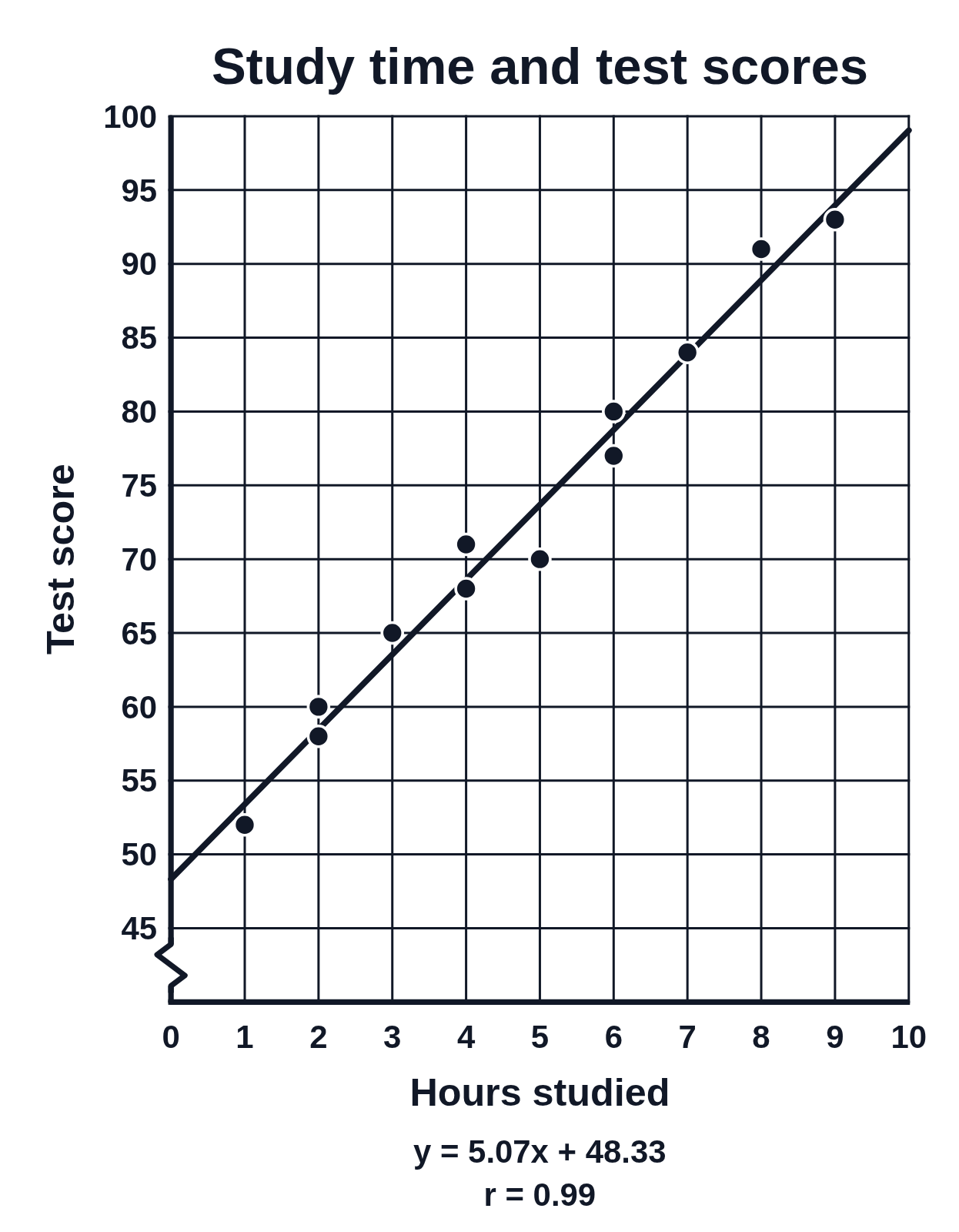 Scatter plot of hours studied and test scores, with a line of best fit
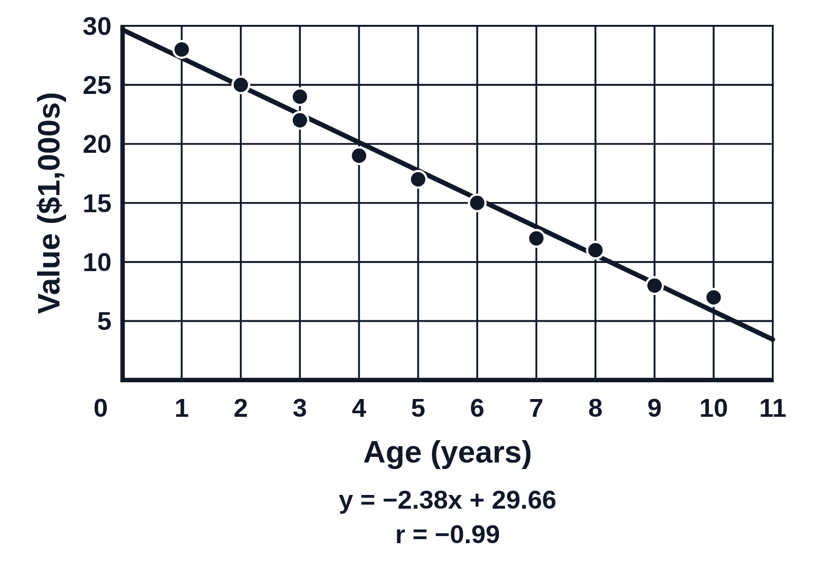 Scatter plot with a negative correlation: car age and value
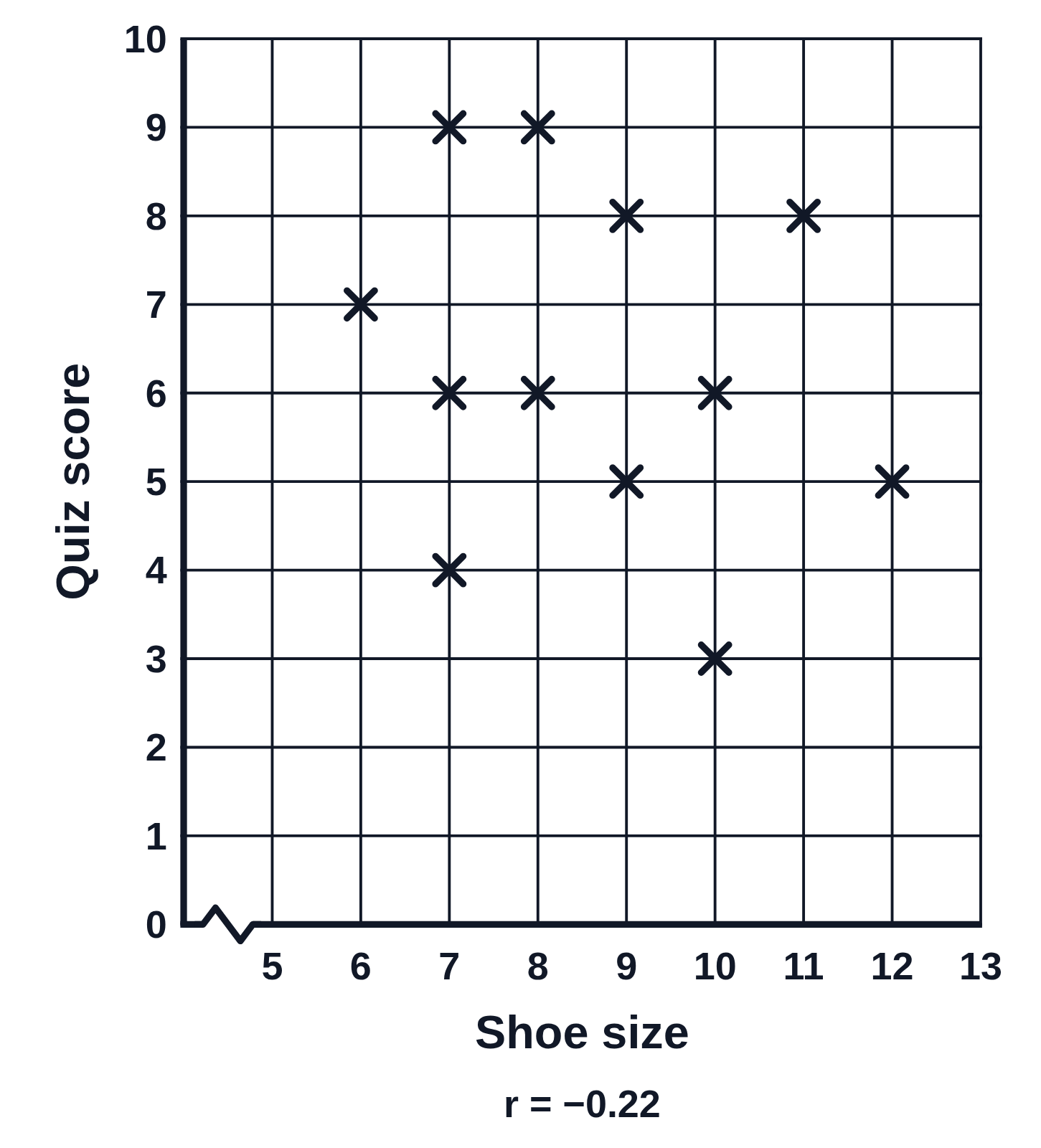 Scatter plot with no correlation: shoe size and quiz score
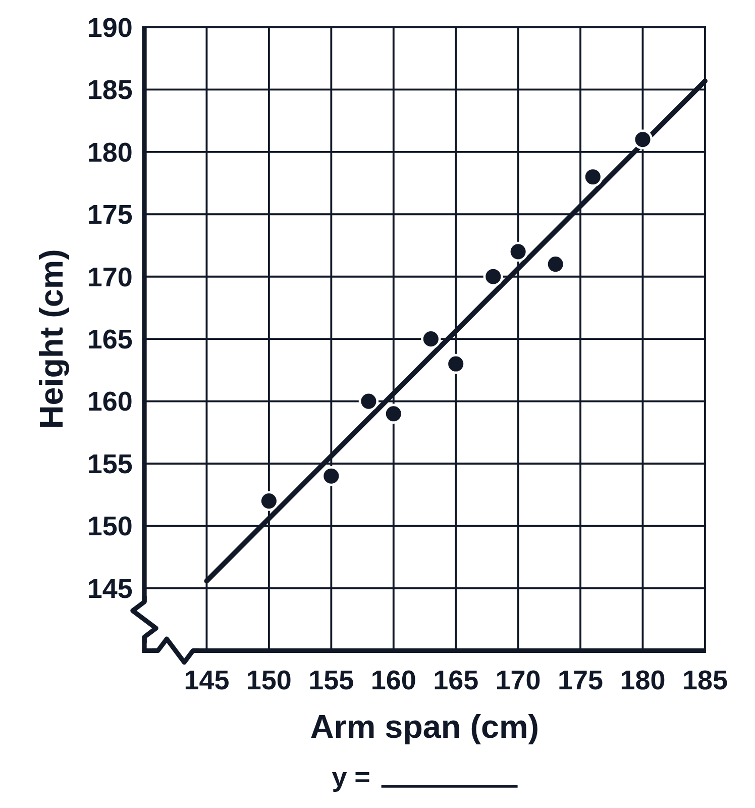 Find the equation of the line of best fit: arm span and height
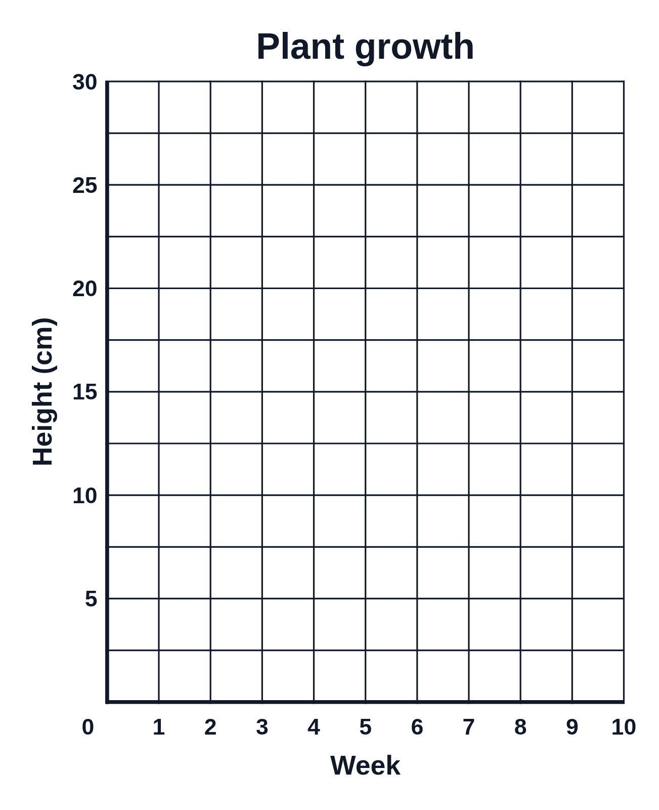 Blank scatter plot axes for students to plot data